Disclaimer: The new display discussed here was introduced in PAMGuard 2.0 however some of the features discussed here have not been released in an official version yet.
What’s PAMGuard?
If you haven’t heard of it before, PAMGuard is an open source program used to detect, classify and localise the sounds that marine mammals make. Many marine mammals species (whales, dolphines, seals etc.) use acoustics to communicate and/or sense their environment and hunt for food. These vocalisations can be detected on underwater hydrophones and used to study the behaviour and distribution of these species, something often called passive acoustic monitoring. However hydrophones can collect a large volumes of data which might take manual analysts a prohibitively long time to look through; thus automated detection and species classification algorithms and programs to allow users to quickly navigate through acoustic data are required. That’s where PAMGuard comes in and as one of the developers I’ll be talking about it quite a bit in this blog.
Initially PAMGuard was built with real-time monitoring in mind. Clicks and tonal sounds from marine mammals could be detected in real time and viewed on various displays. This was, and still is, especially useful in mitigation efforts on seismic vessels used by the oil industry. However, more recently, PAMGuard has become a powerful research tool, used to collect PAM, GPS and other data in the field and analyse it afterwards. I won’t get into everything you can use PAMGaurd for but I’ve been involved in projects which have involved PAMGuard for everything from detecting and localising bomb fishing blasts in Tanzania to tracking the underwater movements of harbour porpoises in the frigid waters of the Scottish Highlands.
PAMGuard is now almost 14 years old. It’s benefitted massively from the increase in computation power of laptops and desktops, however it has used the same technology to build its graphical user interface and now, let’s be honest, it is beginning to look a bit dated.

In 14 years GUI (graphical user interface) technology has come a long way. We now use touchscreen devices much more frequently and people use a much wider of operating systems in their daily lives e.g. Android, Windows, MacOS, iOS and various Linux distributions. PAMGuard is based on a technology called Swing, which is a part of the Java programming language. Swing has recently been replaced by a new GUI technology called JavaFX which designed for more modern user interfaces; unlike Swing, JavaFX can run on Android and iOS, supports multi-touch, is styled by CSS (used to make websites look pretty), is easy to program, has advanced features such as 3D graphics and animations and (most importantly) it looks clean and modern.
This blog post is about a new display the PAMGaurd team and I have designed. It’s the first use of JavaFX in PAMGuard and hopefully a sign of the direction to come. In later posts, I’ll go into a bit more depth on the coding aspect of it, however for this post I’ll simply show off some of the new features and hopefully get you excited about the new possibilities and new abilities of PAMGuard, especially for researchers.
One display to rule them all….
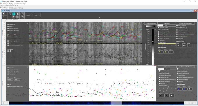
The new display is currently named the “Time based display FX” <- if anyone can come up with a better name please comment. Anyway, the reason it’s called this is because it displays any type of data which can be shown on a display with a time axis. Previously PAMGaurd showed data for spectrograms on a spectrogram display, clicks on a click display, noise on a noise display etc. These all had different ways to interact with data and it got somewhat confusing. Now all time base data is located on the one display which means the user only has to learn to use one display and programmers only have to program one!

The picture above shows the clicks and whistles displayed on a spectrogram on the top graph and the same clicks and whistles displayed on bearing time display on the bottom graph. This offers two ways to visualise data- it’s a lot easier to see click trains from dolphins (black dots) on the bearing time display than the spectrogram, but easier to visualise whistles on the spectrogram than a bearing time display.
Changing how data is displayed is easy. For all data unit types added to one of the displays, there will be a bunch of optional y axis. So for example, clicks can be shown on a time v bearing/amplitude/ICI/frequency axis and whistles can be shown on a time v frequency/bearing axis. So, if both whistles are added to a display then the y axis can be bearing/amplitude/ICI or frequency. In axis settings simply select the axis you want and the display changes accordingly…which brings us nicely on to how to actually change settings.
Letting things slide a bit…
PAMGuard went for a classic design pattern for changing settings. You click a button or menu, a dialog pops up, you change some settings, press OK and then the settings would be changed. The problem with this, particularly for displays, is that settings only change when OK is clicked and so you can’t dynamically change things to investigate how they might make something look without opening and closing a dialog multiple times (very annoying). You can make buttons around a display which change things instantaneously but they tend to take up a lot of space, or you can have non modal dialog but that still blocks the view of the display.
The solution is to use dynamic “hiding” panes integrated into the display itself. The display above is exactly the same display but with all settings panes showing. These slide in an out on pressing a button or dragging with a mouse or finger. Users can change settings dynamically, e.g. change the colour limits of the spectrogram or clicks, which quickly allows you to configure the best settings for your display. Once done, the displays can be hidden again with click or flick of the finger. This means when you want to concentrate on stuff you can have as much space as possible but also easy access to settings when you need them.
Scroll bars are a waste of space
And speaking of space, has anyone ever noticed what a waste of space a scroll bar is? A big blank elongated rectangle of useless pixels. In the new display, we use the scroll bar to show a summary of acoustic data currently loaded into memory, e.g. a raw waveform, spectrogram, click detections etc. (remember that acoustic data is so large you have to load it one chunk at a time into memory).
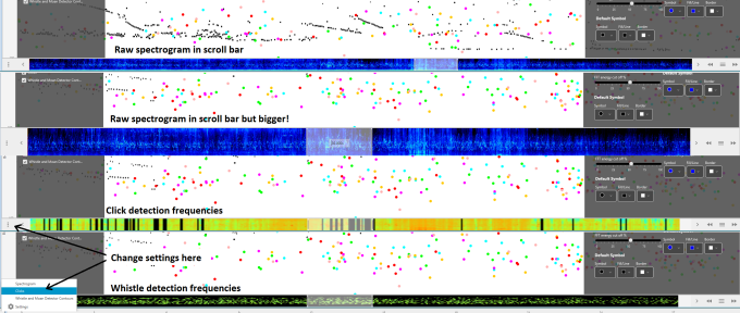
You can easily change what you see in the scroll bar and settings from a button on the bottom left-hand side of the display. This allows users to quickly pick out and scroll to interesting areas of data and most importantly, gets rid of the waste of space!
Marking stuff out
Ok, “cool” – I hear you say (or maybe not) – “But, let’s be honest, you’ve just made PAMGuard look a bit prettier. I want more functionality”. Ah OK, well you’re in luck. Because the infamous PAMGaurd right-click is back, and with a vengeance (you probably won’t get that unless you’ve used PAMGuard for a long time).
The problem with multiple displays is they all had different ways of marking data out. The click detector was great, you could mark out clicks and save them to events in the database. The spectrogram has some functionality to mark out clips but it was a bit complicated. With the new display, any data unit can be marked out and saved to the database or manually exported to do what you want with.

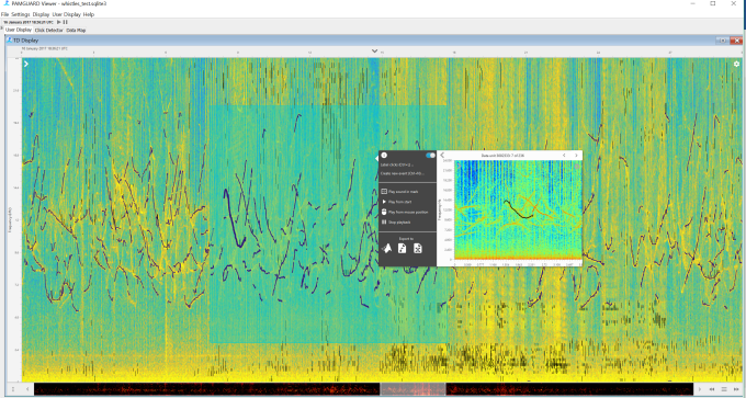
The pictures above show some examples of marking out. Simply right-click on a data unit e.g. a click or a whistle or mark out an area on the display and a this will bring up a menu. You can see a preview of the data unit (e.g. a spectrum, waveform, Wigner plot, FFT plot etc.) and a menu with various options.
To mitigate the risk of this blog post becoming so long that no one will ever get to end I will now mention that PAMGuard has undergone an extensive rewrite under the hood which made all this possible. This deserves more than one line and will be in subsequent blog posts
The menu contains options to send selected data units to another module – this might save them to a database, or go to a localisation module etc. You can also manually export to MATLAB .mat files (thanks matfilerw), a .wav clip or to .csv file to mess around with. This makes it easy to see something interesting, and if you want, to get the data into MATLAB, python, R quickly. Finally, you can also play the selected sounds (this is acoustics after all!)
A quick note on the spectrogram
One thing that’s always been an annoyance in the old spectrogram is that it can run out of memory. The new spectrogram solves that problem through some clever programming. Basically it saves an image of the spectrogram up to certain size. If a user increases the display time the image stays the same size (in memory) but shows more time by simply showing a compressed image. So as you increase the visible time the spectrogram essentially seamlessly converts from a standard spectrogram to a long-term spectral average. That means you can view an hour of 500kHz acoustic data with no more memory issues! (it will still take some time to load though….not much we can do about that (although if anyone wants to write some code to stick FFT calculations onto the graphics card drop me an email))

Don’t worry, no old displays are being removed…yet
It’s been a few years on and off and a bit of fun learning to use JavaFX and using it’s features to build this new display for PAMGuard. But, don’t worry, the old classic displays aren’t going to go for a long time yet. One thing I’ve learned is that JavaFX is a very powerful display technology and makes life for us programmers easier. So, my next project is to introduce a complete new GUI for PAMGuard which can optionally be used instead of the Swing one. Sneak peek below…more on that in the coming months…

Thanks to ControlsFX: for a great library of controls used in this project.
Please comment if you have idea for PG and if you got this far thanks for reading!

Nice work! Is there a chance that the diagram/flow component shown in the last screenshot be available as Open Source? I’m assuming it’s also JavaFX based.
LikeLike
Sure. It’s all in a branch of PAMGUARD. Not vouching for how nice a piece of code it is but is all Open Source.
https://sourceforge.net/p/pamguard/svn/HEAD/tree/PamguardJava/branches/SMRU_JM_J8/smru/src/dataModelFX/
LikeLike
I see now. That’s pretty good work the team has done so far; it’s not so easy to migrate form Swing to JavaFX when you have custom visualizations. One more thing though, the current license is set as GPL v2; any change of dual licensing the code or migrating the license to LGPL, MIT, ASL, or something else?
Thanks 🙂
LikeLike
Thanks. It’s really just a single display embedded in a much larger swing program but I have grand ambitions for the future. Anyway, regarding the license, I’m not sure whether it can be changed that. That would have to go through the official team whihc you can contact at http://www.pmaguard.org. Is this because you wish to use in proprietary code?
LikeLike
apologies…www.pamguard.org
LikeLike
Hello !
I’ve been using Pamguard for a couple of years in real time monitoring seismic-work. I am a biologist and have no experience of using it in an academic context but have considered the possibility of doing a PhD that also goes into AI stuff and machine learning. Maybe one day.
What happened with this work ? Most of the time we use PG version 1.x, recently started to use version 2.0x. I think the use of version 1 is mostly related to better stability. However it’s nice to be using version 2 for a change. However the interface still looks a bit dated, whatever happened to all this line of work ? Is there a plugin or something to be installed to give this added functionality to PG ??
Also say your post about Java FX being dead. Whatever happened to that ?
Hope you’re doing good !
Thanks,
LikeLike